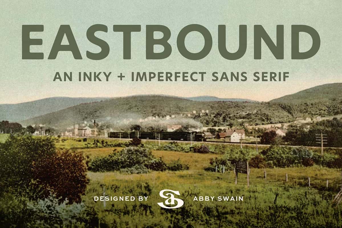

Eastbound – A Vintage Sans Serif with Warmth and Character
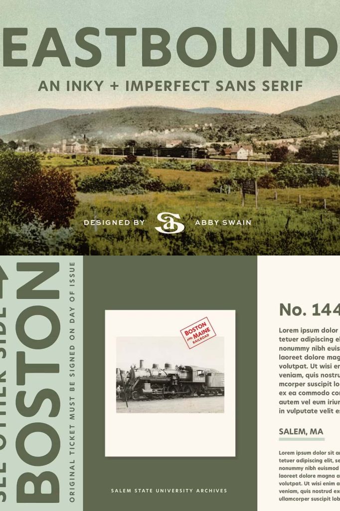
Eastbound is an imperfect sans serif typeface inspired by the nostalgic beauty of vintage railroad tickets and signage. Designed with subtle irregularities and soft corners, it captures the authentic charm of hand-drawn lettering from a time when design was guided by craft rather than precision. Eastbound infuses every project with a touch of warmth and history, combining the grit of travel ephemera with the elegance of classic typography. It’s more than a font — it’s a visual journey through time.
Inspired by the Golden Age of Railroads
The Eastbound font draws its inspiration from the lettering once found on railway tickets, station signage, and vintage travel posters. These designs were functional yet expressive, capturing the excitement of adventure and exploration. Eastbound recreates that same nostalgic feeling through carefully crafted imperfections that give it life and personality. Its soft edges and organic lines create a friendly, human touch that modern geometric fonts often lack. Every letter feels familiar, approachable, and filled with character.
A Perfect Balance Between Function and Personality
Eastbound was created to embody both usability and uniqueness. While it carries the influence of vintage typography, its design remains highly practical and versatile for modern use. The typeface includes uppercase and lowercase letters, numerals, basic punctuation, and bonus arrow symbols — all designed to work harmoniously across diverse projects. From branding to editorial layouts, Eastbound offers designers the tools to bring authenticity and emotion into every word they create.
Bring Authentic Warmth to Your Designs
Unlike many clean and mechanical sans serifs, Eastbound embraces its imperfections. Its uneven lines and subtle inconsistencies give it a human feel — a visual reminder that beauty often lies in imperfection. This makes it an ideal choice for designs that aim to feel organic, handcrafted, and genuine. Whether you’re designing a brand logo, product label, vintage poster, apparel design, or website headline, Eastbound helps you stand out through authenticity and charm.
Versatility Rooted in Heritage
Though Eastbound’s inspiration comes from the past, its adaptability makes it perfect for the present. It thrives in both modern and retro contexts, adding texture and depth to otherwise clean layouts. The soft letterforms complement minimalist compositions while adding a nostalgic edge to creative projects. Its bold simplicity allows it to work across print and digital media alike, ensuring a cohesive look no matter the platform. Eastbound’s unique warmth brings stories to life — whether you’re designing for heritage brands or contemporary campaigns.
Why Designers Choose Eastbound
- Authentic vintage feel: Inspired by old railroad tickets and signage.
- Imperfect charm: Soft corners and subtle irregularities create a handcrafted look.
- Versatile features: Includes uppercase, lowercase, numerals, punctuation, and bonus arrows.
- Emotional appeal: Brings warmth, character, and authenticity to modern design projects.
Rediscover the Art of Imperfect Design
In a digital world driven by flawless precision, Eastbound celebrates imperfection as an art form. It reminds designers that texture, personality, and inconsistency can convey honesty and emotion. This typeface connects the viewer to a story — one of craftsmanship, travel, and nostalgia. Each letter feels like a memory of a hand-painted sign or a stamped ticket, echoing the tactile beauty of vintage print.
Choose Eastbound when you want your typography to feel personal, expressive, and timeless. Its warm imperfection transforms everyday designs into something memorable and human. Whether you’re reviving a classic aesthetic or giving modern work a soulful twist, Eastbound delivers a distinctive voice rooted in history and designed for today.