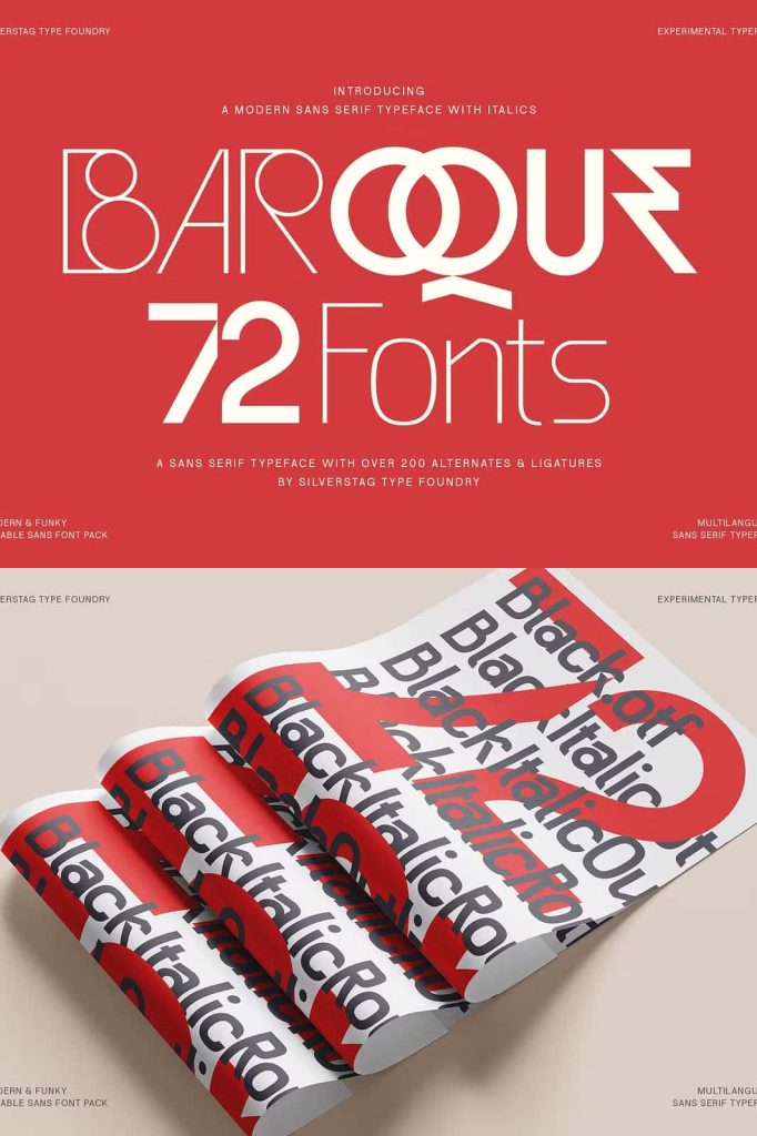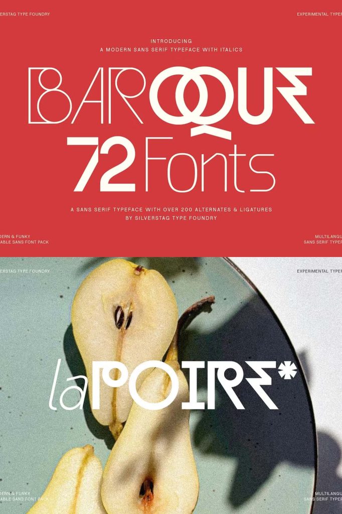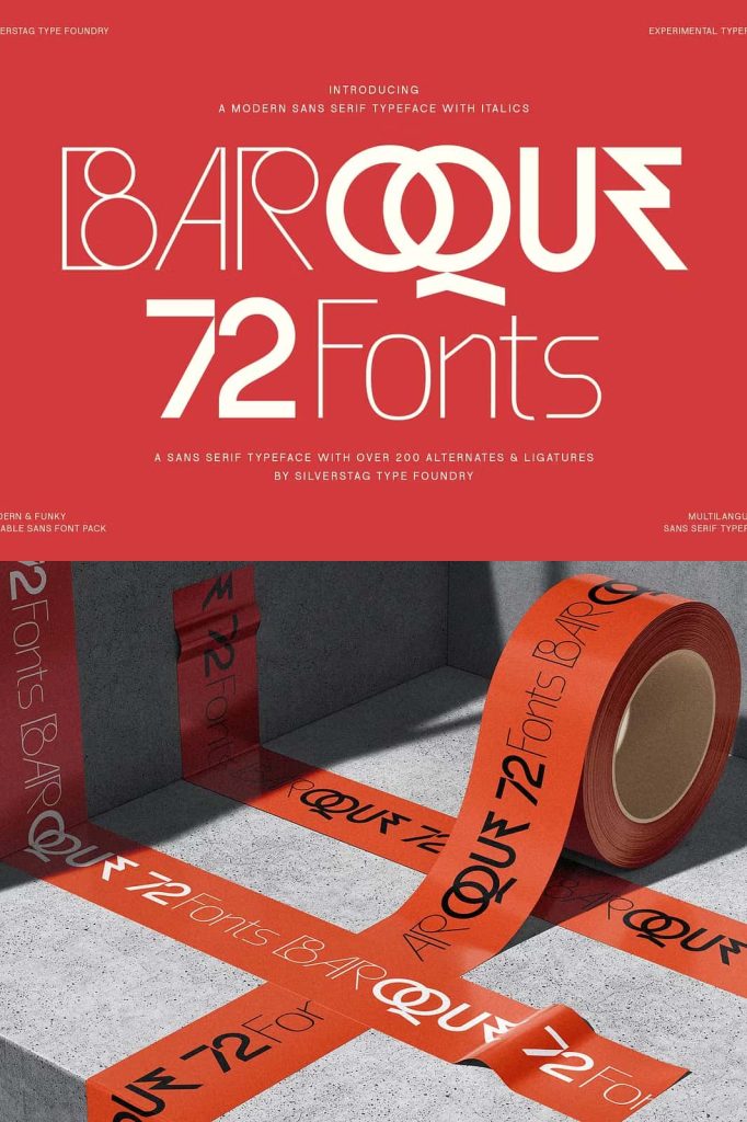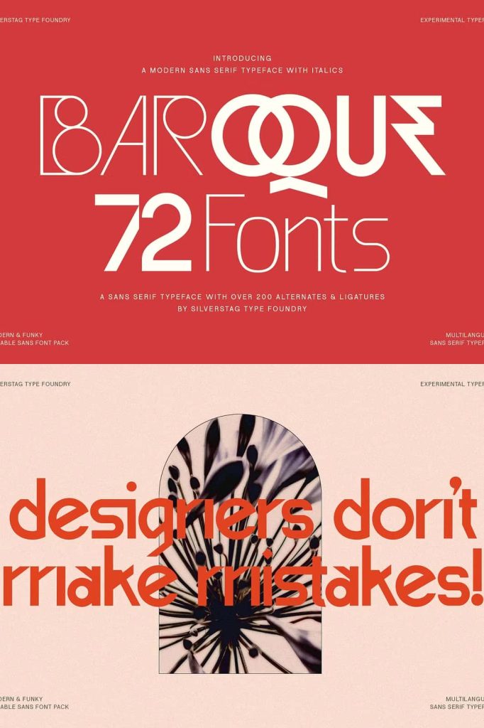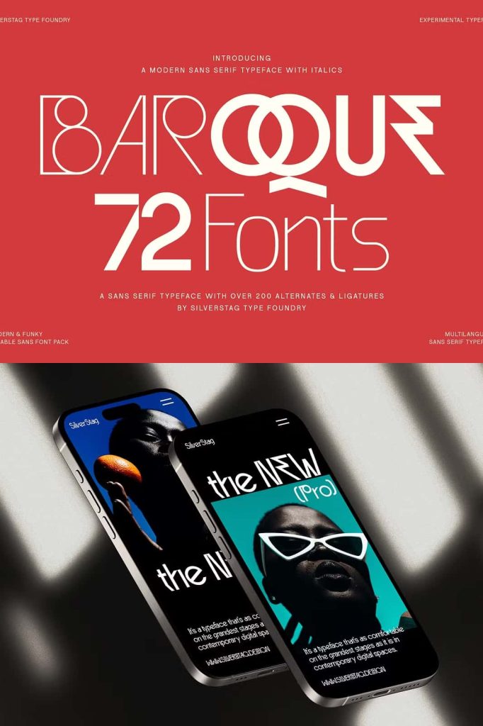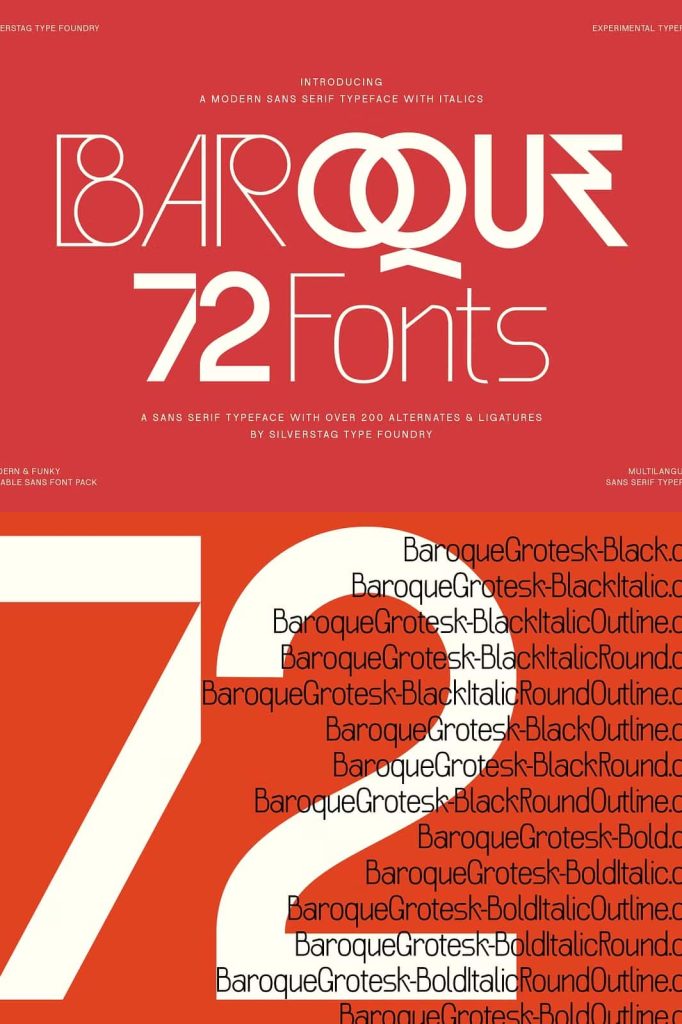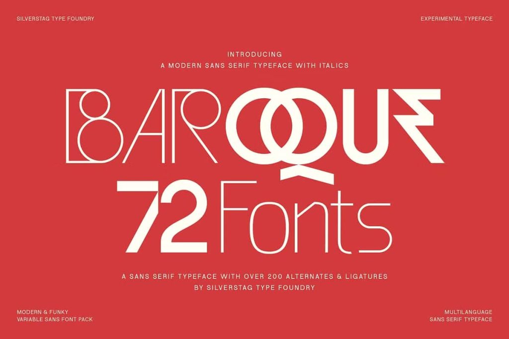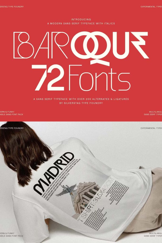

Baroque Grotesk V2 Font: A Timeless Fusion of Classic Elegance and Modern Geometry
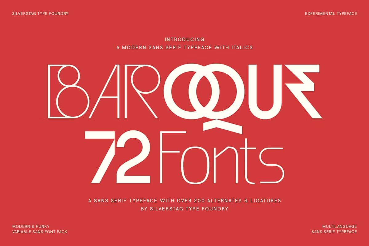
Baroque Grotesk V2 Font stands as a sophisticated example of how timeless design can evolve into a modern visual tool. This expanded font family thoughtfully bridges the expressive beauty of baroque-inspired letterforms with the simplicity and clarity of geometric structure. The result is a typeface that feels both historic and contemporary, elegant yet functional, and expressive without sacrificing readability.
The design approach behind Baroque Grotesk V2 focuses on contrast and harmony. Each character introduces subtle decorative strokes that reference classical design heritage, while maintaining a clean and structured layout suitable for modern digital and print environments. This balance gives designers a truly adaptable font that works well across branding, editorial design, advertising, packaging, and long-form content.
A Typeface Designed with Purpose and Detail
Baroque Grotesk V2 is more than a redesigned update. It represents a carefully refined evolution of typographic expression. The baroque influence brings character, personality, and flair, while the geometric framework ensures consistency and precision. These elements work together to form a visual identity that feels intentional and elevated.
Every weight and style in the font family supports clarity and expression. Thicker strokes command visual attention for display applications, while lighter weights provide gentle refinement suitable for paragraph text, digital UI experiences, and professional publications. This broad functionality makes Baroque Grotesk V2 a flexible choice for both creative experimentation and formal communication.
Where Baroque Grotesk V2 Excels Best
Baroque Grotesk V2 can significantly enhance a wide variety of design categories. Its versatility makes it suitable for minimalist design layouts just as easily as elaborate artistic compositions. You can apply the font in areas such as:
- Brand identity and corporate design systems
- Editorial layouts including magazines, newspapers, and journals
- Digital interfaces, website headers, and application UI typography
- Luxury product packaging and label design
- Book covers, chapter headings, and publishing content
- Advertising, posters, billboards, and campaign visuals
- Cultural, educational, or museum-related projects
Whether used as a primary display font or paired with minimal sans serifs and classic serifs, Baroque Grotesk V2 maintains visual integrity and design cohesion. It brings depth to branding while supporting clear communication.
Design Impact and Visual Identity
What makes Baroque Grotesk V2 truly impactful is its ability to express both heritage and modern innovation. Its subtle decorative forms create a visual tone that feels thoughtful, polished, and artistic. Yet, its geometric foundation ensures readability at any size, making it suitable for headlines, body text, captions, and digital applications.
Designers seeking a typeface that elevates messages with sophistication and intelligence will appreciate the balance found in Baroque Grotesk V2. Instead of choosing between ornate typography and minimalist geometry, this font allows the best qualities of both worlds to exist in harmony.
Enhance Your Design Projects with Baroque Grotesk V2
Baroque Grotesk V2 is more than a typeface; it is a design tool engineered to support meaningful storytelling and polished visual communication. By combining classical beauty with contemporary precision, this font family gives designers the freedom to express creativity while maintaining structure and usability.
Use Baroque Grotesk V2 Font to bring timeless elegance, versatility, and modern expression into your next creative project.