
Ghoip: A Thick Sans Serif Typeface Built for Bold Titles
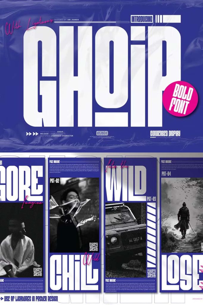
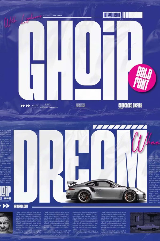
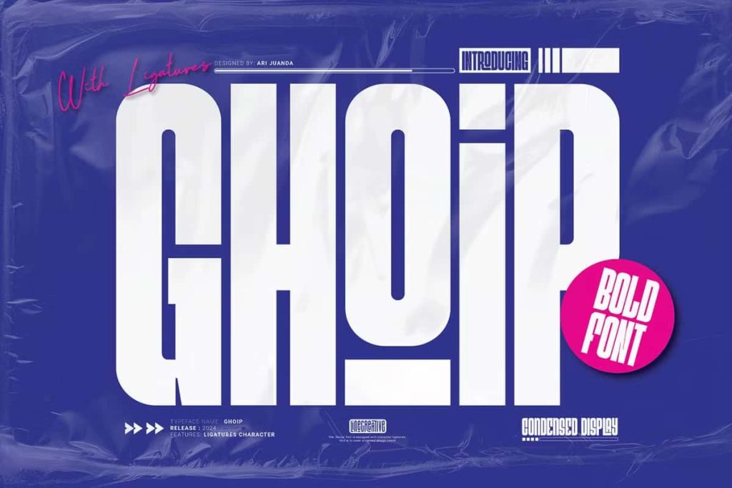
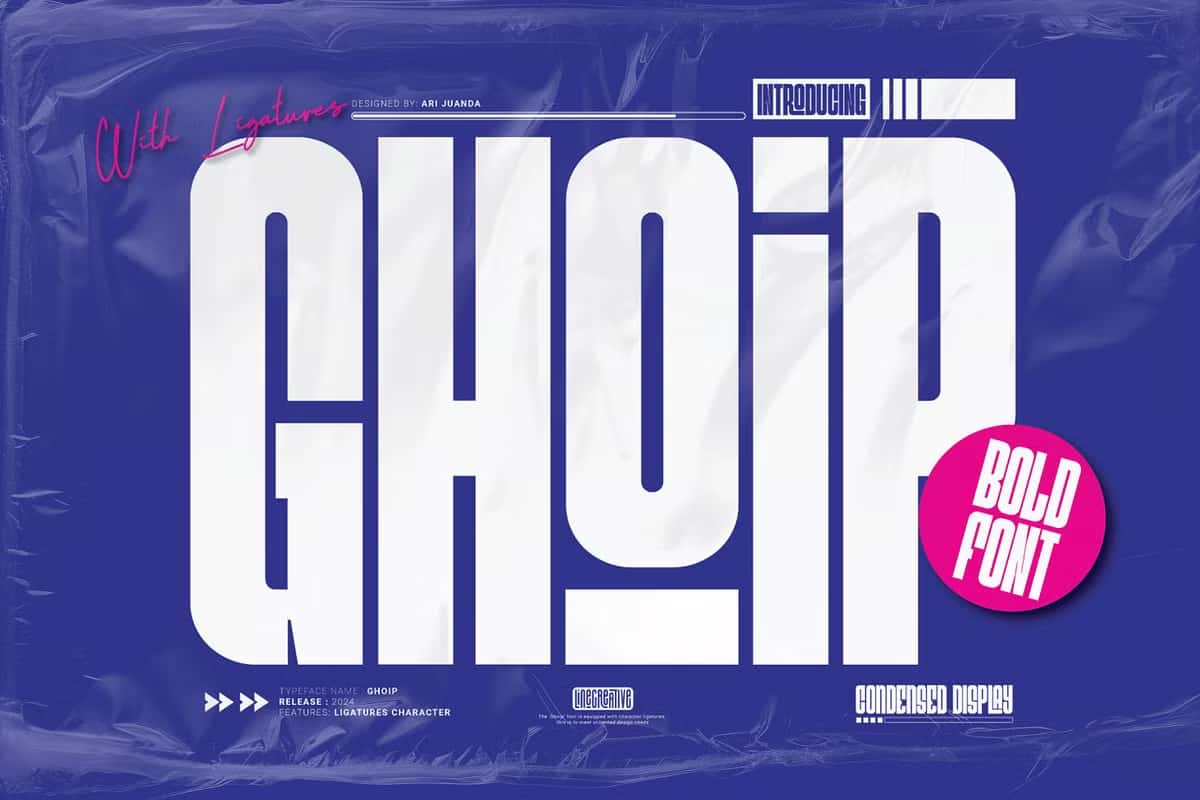
Ghoip is a powerful thick sans serif typeface created specifically for designers who want their titles to stand out with confidence and clarity. Designed with weight, balance, and elegance in mind, Ghoip transforms simple words into commanding visual statements. Its bold construction ensures strong readability, while refined details give the font a sophisticated edge that elevates modern design projects.
A Bold Sans Serif Font with Elegant Character
Ghoip combines bold structure with elegant design principles, resulting in a sans serif font that feels both strong and polished. The thick strokes create a solid foundation that immediately draws attention, making the font ideal for headlines, banners, and prominent display text. At the same time, smooth curves and thoughtful proportions prevent the design from feeling heavy or overwhelming.
This balance allows Ghoip to communicate authority without sacrificing style. The font delivers a confident tone that works well in contemporary branding, editorial design, and promotional materials where visual impact is essential.
Designed Specifically for Bold Titles and Headlines
Ghoip was designed with bold titles as its primary purpose. Its heavy weight ensures excellent legibility even at a distance, making it suitable for large-scale typography. Designers can rely on Ghoip to create strong visual hierarchy and guide the viewer’s attention through layouts effectively.
Whether used for magazine covers, website headers, posters, or advertising campaigns, Ghoip delivers clarity and emphasis. The font maintains consistent spacing and structure, allowing titles to feel cohesive and intentional across different design contexts.
Smart Ligatures for a Smooth Design Experience
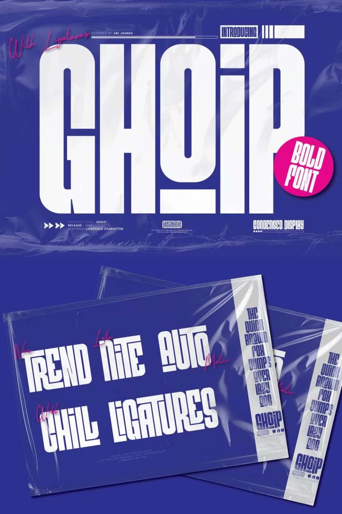
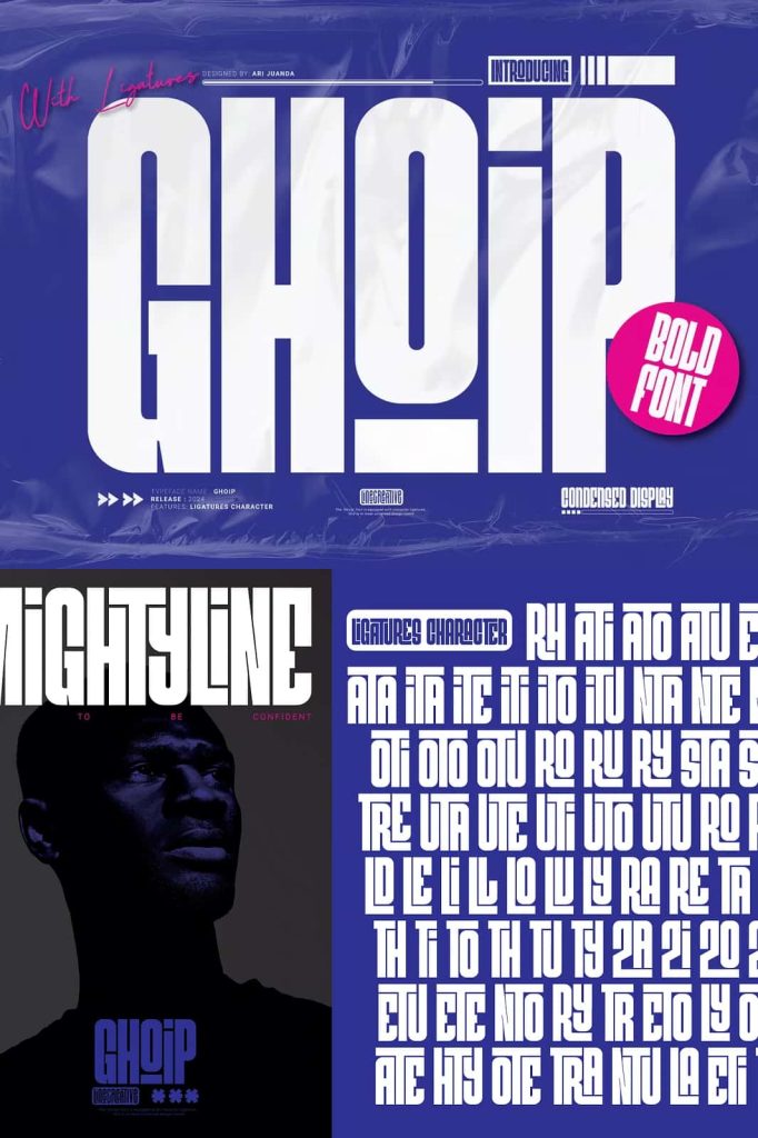
One of Ghoip’s standout features is its inclusion of ligatures. These carefully designed character combinations improve the natural flow of text and enhance visual harmony. Ligatures help eliminate awkward spacing between letters, resulting in cleaner and more professional typography.
By incorporating ligatures, Ghoip offers designers a smoother and more enjoyable design experience. Titles and display text appear more refined and custom, even with minimal manual adjustment. This feature adds subtle sophistication that enhances the overall look of the design.
Versatile Applications Across Creative Projects
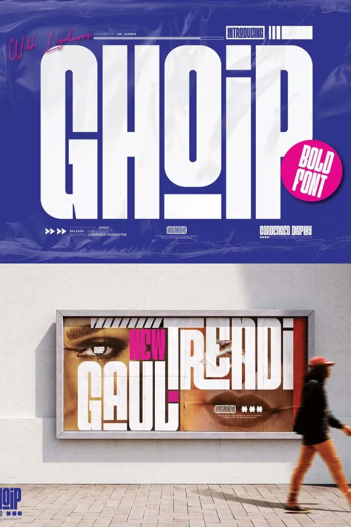
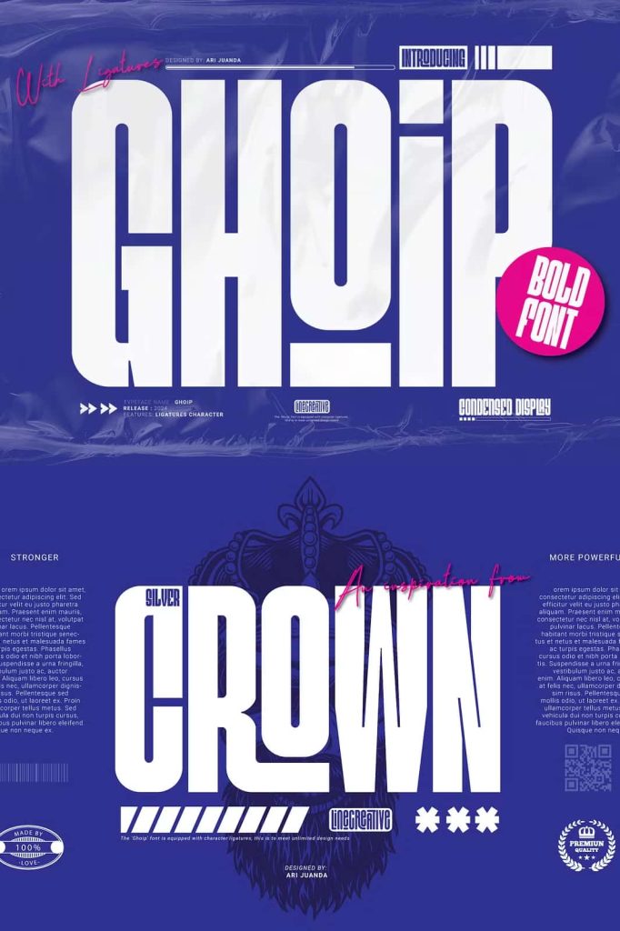
Although Ghoip excels in bold titles, its versatility extends across a wide range of creative applications. The font works effectively in branding projects, where strong typography helps establish identity and recognition. Logos created with Ghoip feel modern, confident, and memorable.
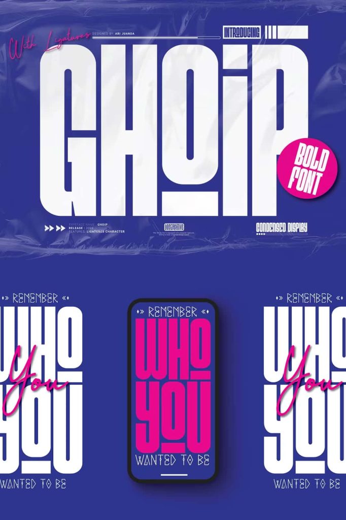
In editorial and digital design, Ghoip performs well in layouts that demand emphasis and structure. It supports visual storytelling by anchoring compositions and providing contrast against lighter typefaces. Designers can pair Ghoip with minimalist fonts to create balanced and engaging layouts.
Reliable for Print and Digital Media
Ghoip delivers consistent performance across both print and digital platforms. Its thick letterforms retain clarity on screens, making it suitable for websites, social media graphics, and digital advertising. In print, the font maintains sharp edges and bold presence on posters, packaging, and promotional materials.
This reliability allows designers to use Ghoip as a core display typeface across multiple touchpoints, ensuring brand consistency and visual strength.
Why Choose Ghoip Thick Sans Serif Font
Ghoip stands out as a thick sans serif font that blends boldness with elegance. Designed for impactful titles and enhanced by smart ligatures, it offers a refined yet powerful typographic solution. By choosing Ghoip, designers gain a dependable typeface that strengthens visual communication, enhances creative workflows, and delivers confident, professional results across a wide range of design projects.