
Sakarine – Fresh and Clean Sans Serif Font
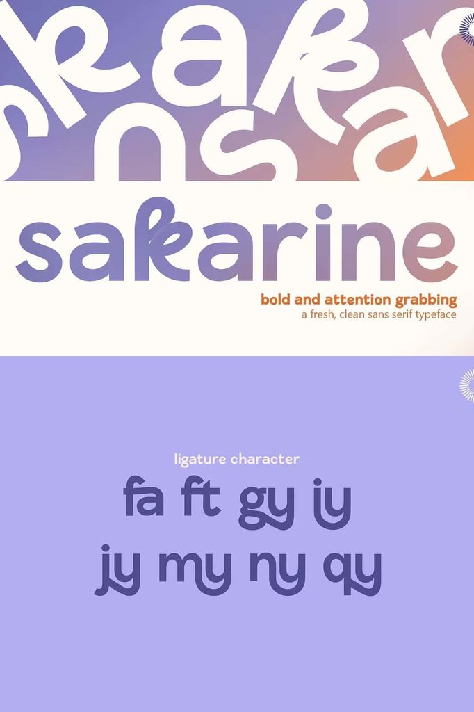
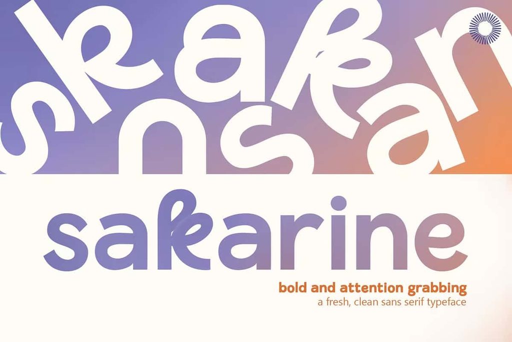
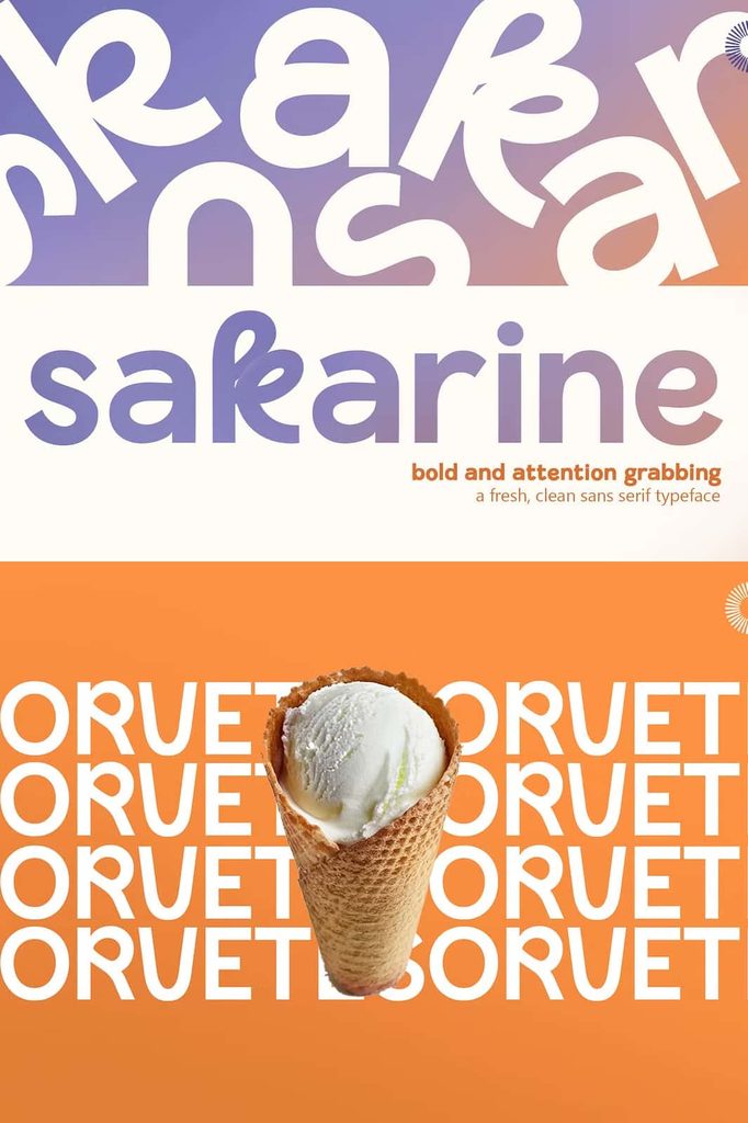
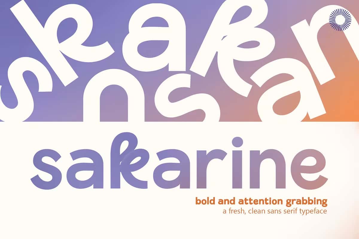
Sakarine is a fresh, clean sans serif font designed in 2024 by Siela Mara for Setara Langit. This typeface began with a simple and practical goal: to create a readable, harmonious font that works beautifully across a wide range of text-based projects. During the design process, however, the creative direction naturally evolved. What started as an exploration of practicality gradually developed into a typeface with stronger stylistic character and a more distinctive visual presence.
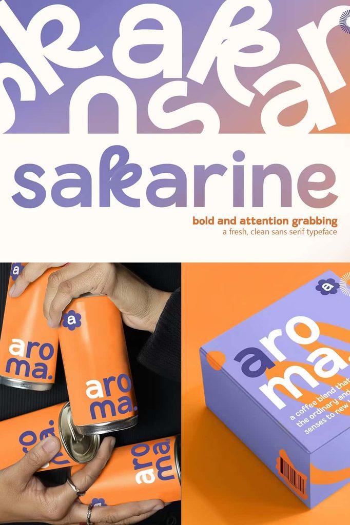
The result is Sakarine, a contemporary sans serif font that balances clarity with personality. Its clean construction gives designers a dependable foundation for everyday typography, while its bolder stylistic elements add visual interest without overwhelming the overall composition. Sakarine brings a modern touch to branding, editorial layouts, promotional graphics, packaging, social media designs, websites, and many other creative applications.
A Practical Approach to Typography
The original concept behind Sakarine focused on creating a practical text typeface. Siela Mara approached the design with readability, balance, and harmony in mind. Each character works together to create a smooth typographic rhythm, helping readers move naturally through blocks of text.
This practical foundation makes Sakarine especially useful for designers who need a font that looks polished while remaining easy to read. You can use it for headings, subheadings, short paragraphs, descriptions, captions, and other textual elements. Its clean sans serif structure keeps compositions organized and contemporary, allowing the content to remain at the center of attention.
Clean Forms with Bold Character
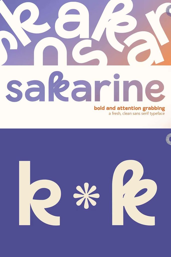
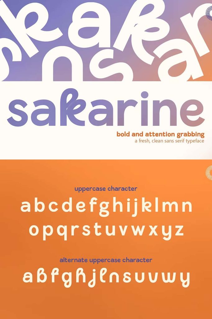
Although Sakarine started as a restrained and functional typeface, the creative process introduced a stronger personality. The design incorporates bolder stylistic elements that give the font a more expressive identity. These details help Sakarine move beyond a purely neutral sans serif style.
This combination creates an engaging contrast. The clean construction provides consistency and readability, while the stronger details introduce character and energy. Designers can therefore use Sakarine when they want a modern typeface that feels professional but does not appear overly ordinary or generic.
Designed for Modern Creative Projects
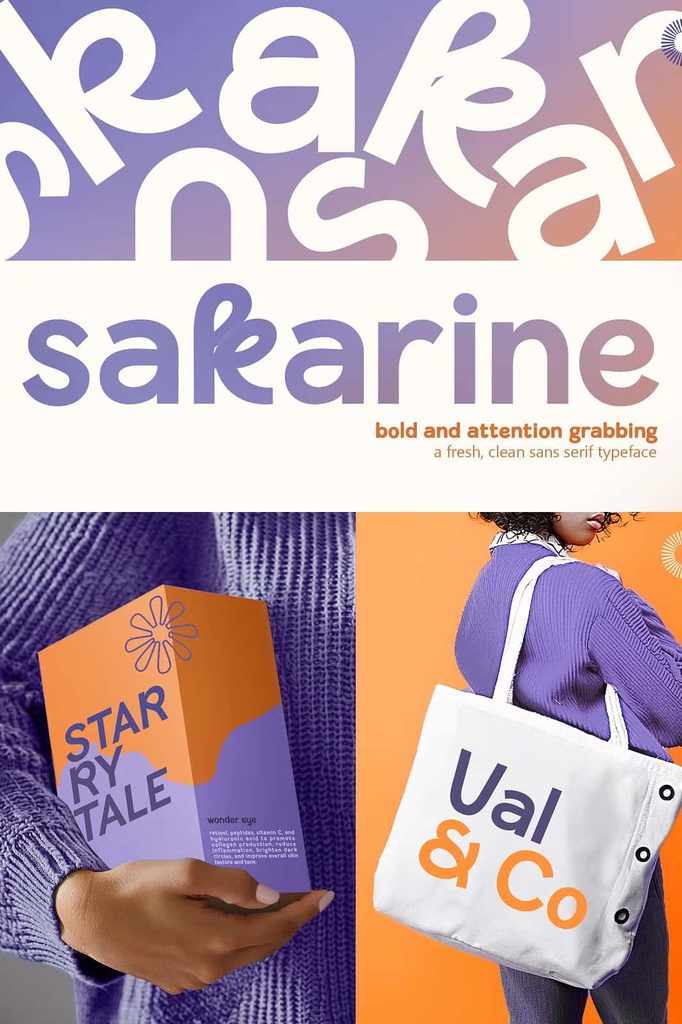
Sakarine adapts easily to a variety of design environments. Its contemporary appearance makes it a strong choice for modern branding projects, where typography needs to communicate both confidence and creativity. Use it for logos, brand names, business materials, promotional campaigns, and visual identities that require a clean yet distinctive typographic voice.
The font also performs well in editorial and digital layouts. Designers can apply Sakarine to magazine titles, articles, websites, presentations, advertisements, posters, and social media graphics. Its readable structure supports longer content, while its stylistic personality helps important text stand out.
Branding and Logo Design
Sakarine can give a brand identity a contemporary and refined appearance. Its clean forms create a professional foundation, while its distinctive details help a logo or wordmark feel more memorable. Use the font to explore modern brand concepts, creative businesses, lifestyle brands, studios, fashion projects, and other visual identities that benefit from expressive sans serif typography.
Editorial and Text Layouts
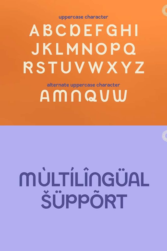
Because readability played an important role in its original development, Sakarine works naturally in editorial applications. Use it for titles, headings, subheadings, captions, short descriptions, and body text. The harmonious letterforms help maintain a consistent visual rhythm across a page, making the overall layout feel structured and balanced.
Digital and Social Media Design
Sakarine also suits modern digital content. Apply it to Instagram graphics, website headers, advertisements, online portfolios, presentation slides, banners, and promotional content. Its clean appearance remains effective across different layouts, while its stronger stylistic character gives digital designs a recognizable visual tone.
A Balance of Function and Expression
One of Sakarine’s defining qualities is its ability to combine function and expression. Many practical sans serif fonts focus heavily on neutrality, while highly expressive typefaces can sometimes sacrifice readability. Sakarine takes a more balanced approach. It preserves a clean and readable foundation while introducing enough stylistic detail to make the design feel fresh.
This balance gives designers greater creative freedom. You can use Sakarine subtly in a minimal layout or make it a stronger visual element in a bold composition. The typeface can support a restrained corporate identity just as effectively as it can contribute to a creative campaign or contemporary poster.
Bring a Fresh Typographic Style to Your Designs
Sakarine represents a creative journey that began with practicality and naturally developed into something more expressive. Siela Mara designed the typeface with a clear focus on readability, harmony, and everyday usability, then allowed the creative process to introduce bolder stylistic elements. That evolution gives Sakarine its distinctive identity.
If you are searching for a Sakarine sans serif font that combines clean construction, practical readability, and modern personality, Sakarine offers a versatile solution. Use it to build sophisticated branding, engaging editorial layouts, modern websites, promotional materials, packaging, posters, and social media graphics.
With its fresh appearance and adaptable character, Sakarine can become a reliable part of your typography collection. It gives designers the freedom to create layouts that feel clean, contemporary, harmonious, and confidently expressive.